Surface Product Page Redesign
ABOUT
When I joined Microsoft Store, one of my first projects was to bring a new look and feel to the Surface product pages. As a flagship device that was starting to gain marketplace momentum, we needed to create a page that could present the latest Surface offering in a heroic light.
STRATEGY
Striving to create a page that would delight customers, we focused on bringing attention to the impressive design and unique traits of Surface Pro 3. The page layout balanced compelling imagery and effective storytelling which highlighted product features and maximized visual impact.
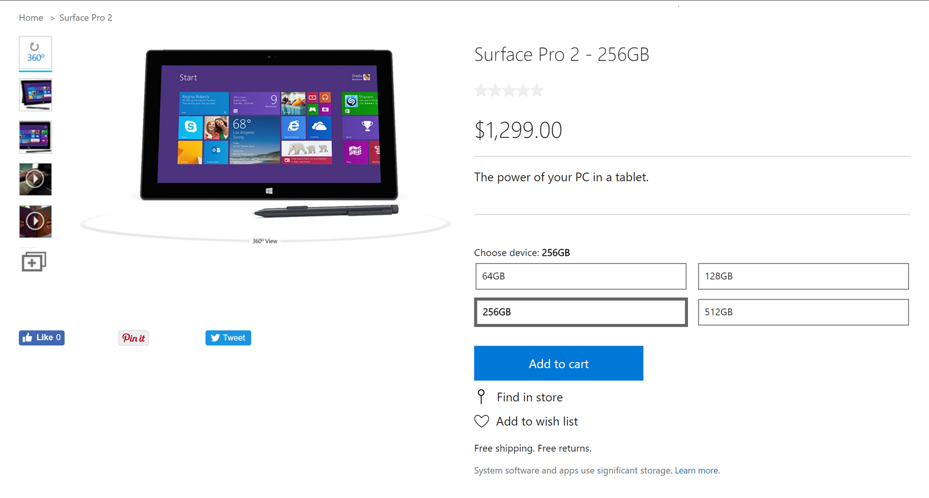
Original Design | Surface Pro 2
FOCUS AREA
When customers landed on a Surface product page they found little information, storytelling, or visuals.
Below the fold, the pictures were small, the words ran into images, and the feature-driven copy lacked romance.
Results Snapshot
Customers responded favorably to the redesigned page, with a 23% spike in conversion, 67% increase in CTR, and 3-fold increase in scroll reach.
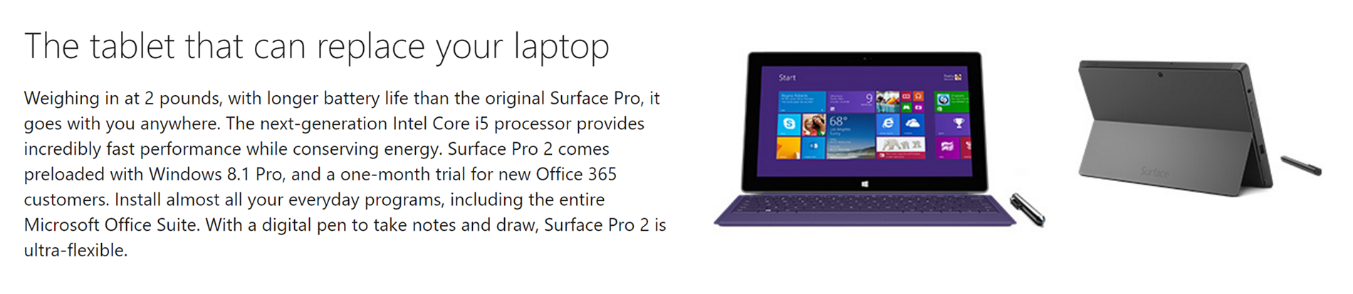
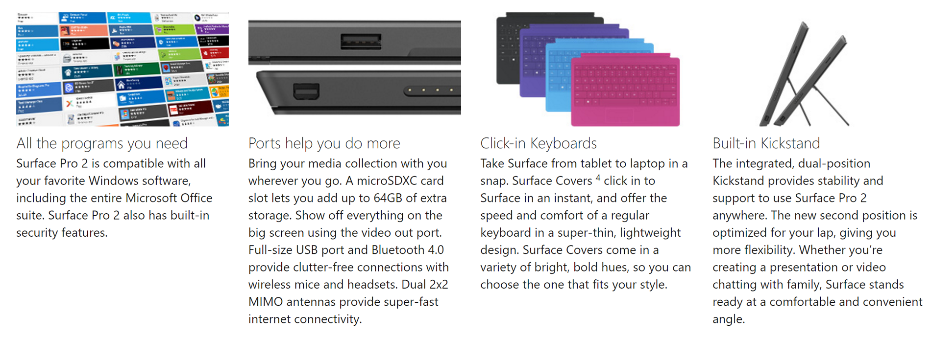
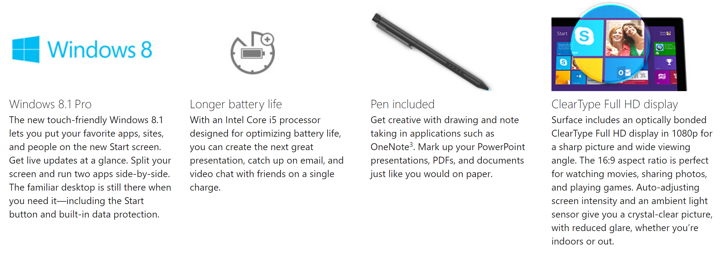
Redesign | Surface Pro 3
HIGHLIGHTS
Revamped Buy Box with larger imagery, plus added product description and reviews.
Buy now button dropped customers right into the purchase funnel with no hassle.

Features navigation that delivered customers to where they needed to go.

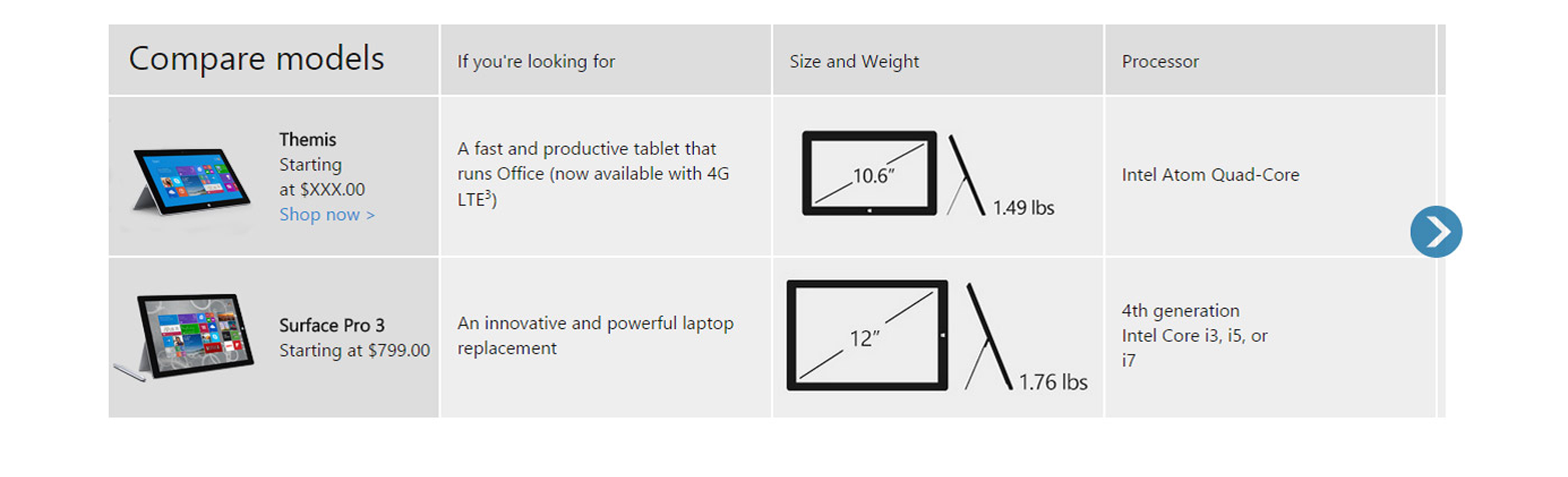
Added Surface Compare Chart.
Total copy rewrite with bolder headlines and more product romancing than before.

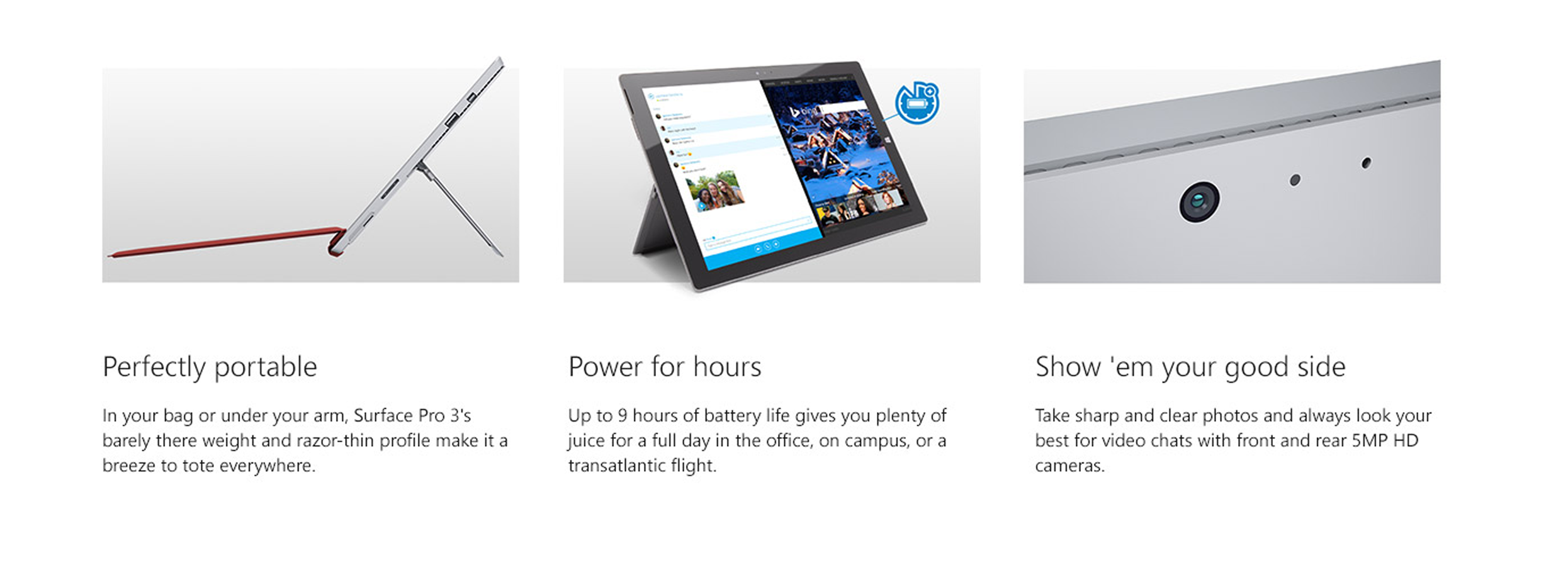
Row of Feature Modules that provided a nice balance between features and benefits.

Better blending of imagery with words this time around made for a more scannable page.

Rounding out our narrative with company initiatives like cross-promoting Windows App Store.


Introduced an entire section dedicated to touting the Surface Pen technology and its benefits.

